Every website has an FAQ page today, but the question is, how many companies have a FAQ section that’s comprehensive, well-designed, and adept at solving customer queries?
Not many!
Often, FAQs are lying in some dark corner of a website, from where they are hardly noticeable or accessible. Since FAQs don’t seem to offer a direct, tangible benefit, they are put on the back burner – which is a big mistake.
But, if you think about it, FAQs can be incredibly beneficial in the long run.
Creating a FAQ page that answers most of your customers’ and prospects’ questions is a great way to increase their confidence in your brand, reduce support requests, and improve customer delight.
And if that weren’t enough, FAQs also play a vital role in improving your website’s traffic and rankings.
So, if you’ve been sidelining FAQs, it’s time to give them the attention they deserve!
In this blog, we will discuss FAQs in detail, including their benefits, steps to create them, and some awesome examples.
Let’s go!
What Is a FAQ Page?
A FAQ page is a dedicated section on your website that provides detailed answers to the common questions customers might have about your products or services.
This is the place where both customers and prospects can solve problems right away when they are browsing through your website. It’s a one-stop platform where customers can find all the help they need to make informed purchase decisions or troubleshoot product-related issues.
How to Create a FAQ Page
A FAQ page is a critical part of a website – one where visitors can instantly find answers. Now, this seems simple, but in reality, when you start working on FAQs, it can be a challenging task.
You can’t just simply jump into the process right away. You need dedicated faq software and a systematic approach to get the results you want.
Let’s dive in to explore the process of creating a FAQ page in detail.
Get a Suitable FAQ Page Template
FAQ Templates can be incredibly supportive when creating FAQs.
They provide a ready-made framework comprising a home page and table of contents. You also get pre-defined categories and subcategories, so you can use them as they are or rename them to suit your needs.
Most templates are customizable, which means you can add your company’s logo and name and use colors, fonts, and themes that reflect your branding.
You can also change the header images and page titles to ensure the template is in complete alignment with the main theme of your FAQ page.
Start Adding Common Customer Questions
Identifying the right questions that customers really ask is a process that will require consultation with your support, sales, and even marketing teams. These are the teams that are always at the forefront of customer interactions, so the insights they will be able to provide you, no other team would.
You can also utilize your CRM, help desk, and live chat interactions to identify the most important questions to be covered in your FAQ section.
Once you have identified the questions, start creating content for your FAQs.
Most FAQ tools offer a built-in authoring system to help you write, edit, and publish your FAQs across platforms. In case you have some content already created and placed in Word docs, PDF files, or PPTs, you can directly import them.
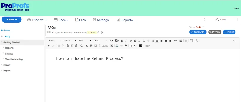
Once the content is imported, run a quality check to ensure there are no factual errors.
Want to take your FAQs to the next level? You can boost your FAQ page performance a notch higher by adding relevant images and videos to the answers.
A page that’s full of text can be overwhelming for people looking for an easy way to get the right information. With visual imagery present in just the right articles, your customers will be able to comprehend concepts and solve problems faster.
Encourage Collaborative Content Creation
Creating online FAQs is not something that a single person can manage from start to finish.
A FAQ page is supposed to be a comprehensive and reliable source of information, which is why you need a dedicated team with responsibilities carefully distributed among the members.
When employees from across departments come together under a single roof and share their expertise, your FAQ page will turn out to be more insightful.
Now, the question is how to enable collaborative authoring!
With a tool like Knowledge Base Software, you can add users and create a team for managing your FAQ page.
But you cannot add just anyone to your team. You need to identify people who have deep knowledge about the subject and can provide keen insights into customers’ pain points.
Once you have the team ready, assign members relevant roles and permissions to help them work together without conflicts.
For example, some members can be assigned the role of a contributor, while others can take up editorial duties. You can also assign the role of administrator to a few and give them full control over every activity happening on the FAQ page.
Such a collaborative process leads to all members bringing their best foot forward, which positively impacts the quality of content.
Here’s a quick video on how teams can collaborate to build a knowledge base:
Build a Clear & Effective Structure
Customers want answers, and they want them fast. They take your FAQ page seriously and expect to find everything they need.
Structuring your FAQs in the simplest and the most logical way possible is therefore important.
It’s a big turn-off for customers when they visit your FAQ page and feel even more overwhelmed. With a solid structure, your FAQs will have a seamless flow starting from the most basic questions and gradually proceeding toward complex concepts.
To strengthen the structure, here are a few tips you can adopt:
- Group the questions by products, services, and topics
- Keep the answers short and straightforward
- Add internal links to direct customers to helpful articles
- Use language that’s easy to understand
Consider implementing these tips and you will find your FAQ page will be way more scannable for customers.
Optimize for Search Engines to Generate Traffic
Google is the go-to platform when it comes to finding information about anything in the world. Even customers prefer using Google when they need help with a topic, product, or service.
However, the process of finding help can get exhausting if customers have to wander through multiple links. Optimizing your FAQs for search engines is not only beneficial in terms of traffic and ranking, but it also means customers find help faster.
An SEO-friendly FAQ page will ensure your content gets a place in the top search results, which in turn helps attract more eyeballs.
Here are some simple tips to optimize your FAQs for search engines:
- Conduct keyword research to identify the most searched keywords and analyze if you have covered those queries
- Organize your content logically to make crawling easier for Google
- Make your content scannable by using bullet points and keeping your paragraphs short
- Use internal links to help Google understand the connectivity between articles
These tips will help you create SEO-friendly FAQs that will lead customers directly to your website without putting in much effort.
Closely Monitor FAQ Performance
Once you have published your FAQs on the website, you need to closely track their performance.
You only win half the battle by creating a FAQ page. The other half depends on how well and how frequently you maintain your FAQs.
Customer needs are bound to change with time. It’s not necessary for customers to face the same problems as they used to encounter a year back.
Over time as you find a shift in customers’ search patterns, including the articles they like and the ones they don’t find helpful, your FAQs will also need to be updated.
That’s where reports come into the picture.
The best FAQ tools out there are equipped with built-in reports that provide comprehensive insights into:
- Article upvotes and downvotes
- Total searches and views
- Failed searches
- Broken links
- Comments received on articles, and much more.
Tap into these insights to understand what’s really working and what’s not. This will help you bring meaningful changes to your FAQs and align them with your customers’ evolving needs.
Here’s a quick video to help you understand what reports are and how to analyze them.
FAQ Page Examples to Help You Create Your Own
Before you jump into the process of creating a FAQ page, it’s vital to look at some FAQ page examples. The examples given below are some of the best and will definitely be helpful when you start creating and designing your own FAQ page.
Let’s dive in!
Spotify FAQ Page
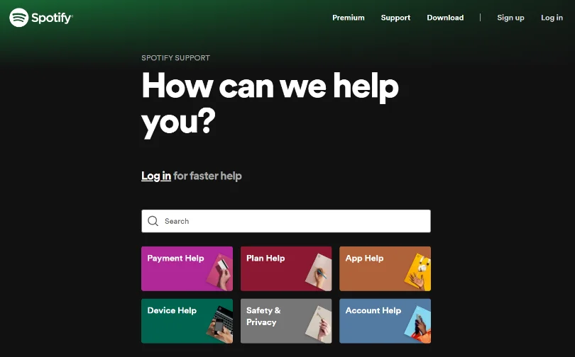
Spotify’s FAQ page has a big search bar right at the top – an essential element that’s important for customers to look for answers instantly.
This digital music platform goes one step further by categorizing all important topics right below the search bar. This is a good way to save customers from the hassle of digging through each page to get the desired information.
As you dive deeper into Spotify’s FAQ page, you will find they have made smart use of video tutorials and images to demonstrate concepts and processes.
Zappos FAQ Page
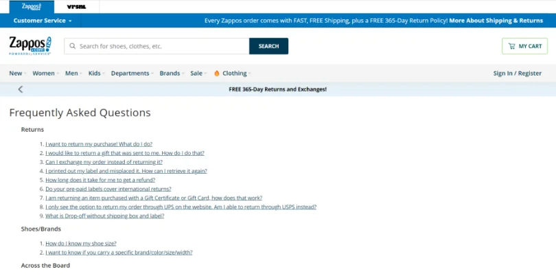
Zappos, a popular e-tail company, has done a great job with its FAQ section.
As you can see, the FAQ page is well organized, with questions listed in broad categories for easy navigation.
The only negative part is that the page doesn’t have a search bar. But, with all categories listed on a single page, customers can hop on to their desired section with just a click.
Etsy
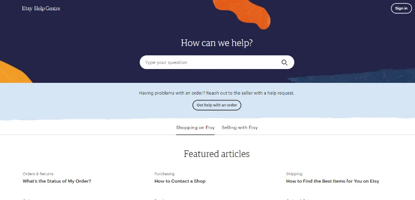
Etsy is another popular e-commerce site that sells handmade items and craft supplies across the globe.
What’s appealing about Etsy’s FAQ page is its simplicity. A search bar at the top and featured articles right below it allow customers to hop on to the desired page quickly.
Also, as you go down the page, you will find the “Contact Support” option as well – a great approach to help customers connect with the support team in case FAQs don’t help.
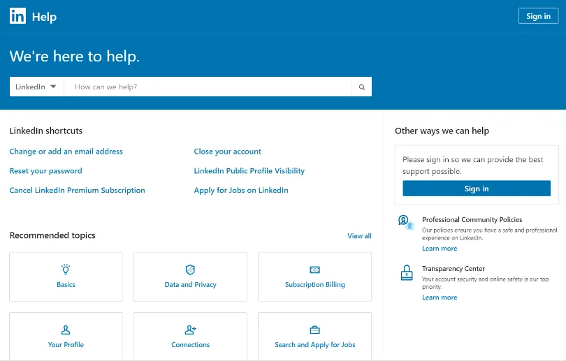
LinkedIn is a top player when it comes to its FAQs.
Appealing color combinations of white and blue present LinkedIn shortcut articles featuring the most common topics like resetting passwords and closing an account. This is a big relief, especially for those who are new to the platform and need guidance on basic topics.
Next comes the “Recommended Topics” section, that’s mostly about advanced functionality related to job applications, subscription billings, etc.
All in all, LinkedIn’s FAQ page contains all the help customers might need to make the most of this platform.
Samsung
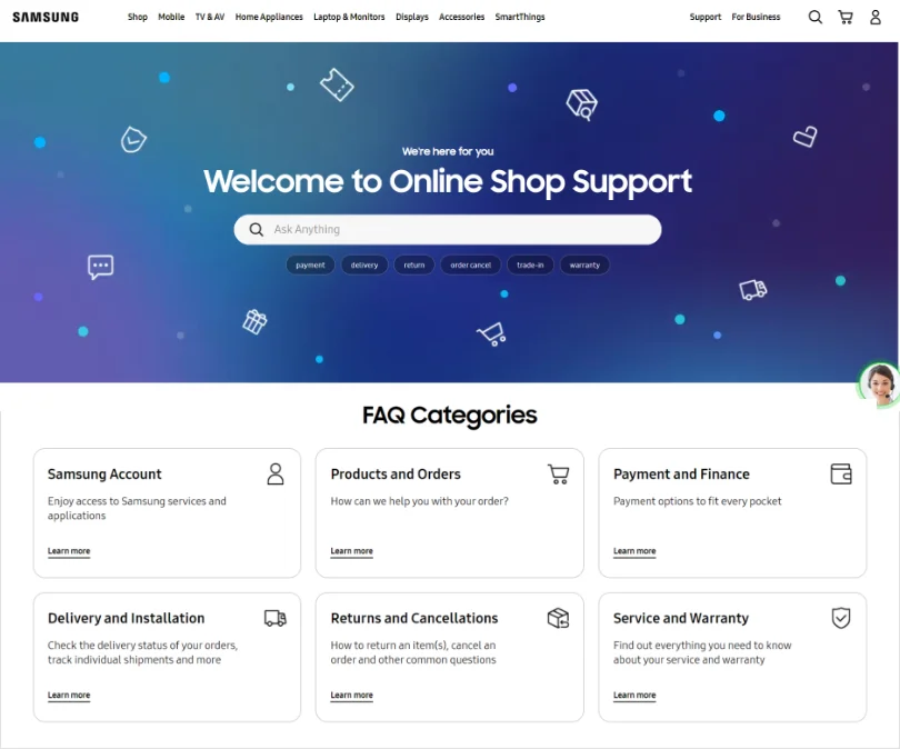
Samsung, a renowned name in the electronics industry, has a beautifully-designed FAQ page on its website.
Right below the search bar, you will see a bunch of important topics. Clicking on these hyperlinks will take you directly to the desired page. This is a big time-saver for customers as they don’t have to wander through multiple pages to find what they need.
Each page or category listed comprises specific questions related to the topic with crisp answers written in simple language.
Slack
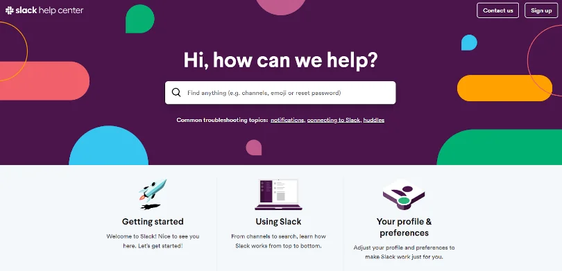
Slack’s FAQ page is another brilliant example you could take some inspiration from.
Common troubleshooting topics are showcased right below the search bar – an approach similar to Samsung’s. This makes the self-service experience quite accessible, as customers don’t have to dig deeper or scroll through multiple pages to get what they need.
At the bottom of the page, there are easy-to-follow tips to help customers make maximum use of Slack.
Amazon
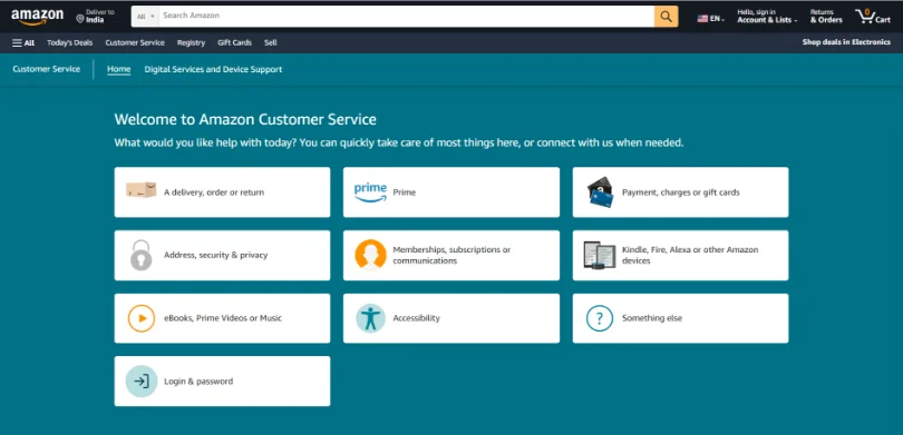
Amazon’s FAQ page lists down the key categories in the very beginning, making self-service highly accessible for customers.
As you scroll down, you will find a search bar, and right below it, some important topics that customers usually have about refunds, cancellations, shipping, and delivery.
Amazon’s FAQ is a good example of the fact that even if you are a big brand, you don’t need to go all flashy and blingy with your FAQs. The more simple and user-friendly it is, the better it will serve your customers.
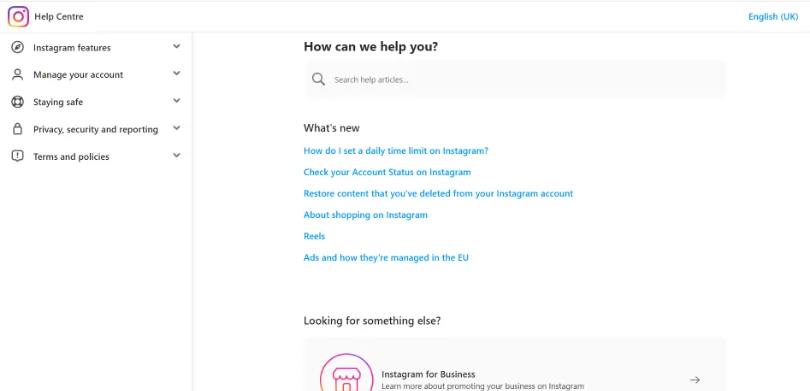
Instagram, a popular social media platform, offers a prim and proper FAQ page. At the top is a search bar and on the left-hand side, you can find key topics like Instagram features and account management.
The best part is, as you click on the search bar, you will instantly find the top 5 articles, making information gathering a smooth sail.
Nike
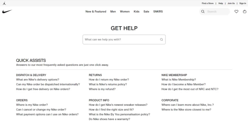
Nike’s FAQ page looks minimal yet impactful.
A robust search bar and important topics listed under the “Quick Assists” section – both these elements ensure customers are able to find answers in just a couple of clicks.
The most interesting part about Nike’s FAQ page is that it also provides customers the option to call, chat, or email in case their queries aren’t resolved.
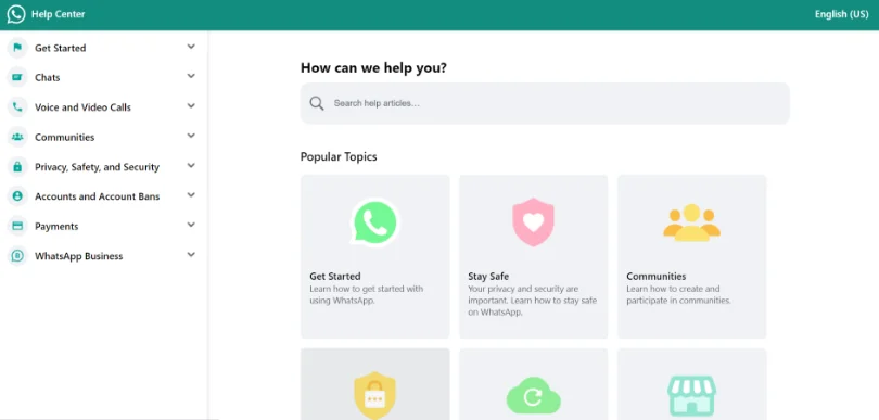
WhatsApp’s FAQ page shows that simple can be beautiful too. As you can see, the layout is neatly designed, with just the right dash of colors.
This no-frills design instantly leaves a positive impression on readers, declutters their minds, and lets them focus solely on solving the problem at hand.
Wistia
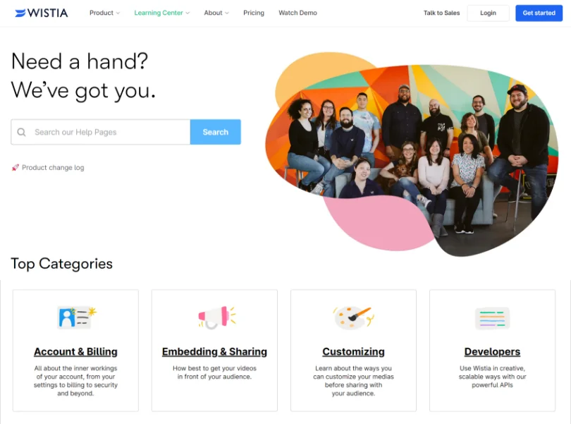
Wistia’s FAQ page comes with a floating footer, which is nothing but a search bar along with a link to submit the ticket.
This is a great strategy designed by Wistia to let customers search for answers instantly and even seek assistance from the support team when the FAQs don’t help.
Customers don’t have to go to a different page to contact Wistia’s support team. The option is available right on the FAQ page.
AirBnB
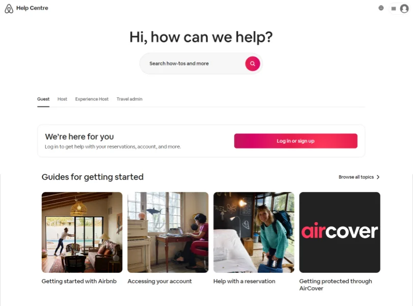
AirBnB’s FAQ page has a simple and appealing design.
Right at the top, you will find the “Getting Started” guides on important topics such as accessing your account, reservations, etc. Clicking on them will directly take you to the relevant section, where you will find in-depth information about the subject.
Right below the guides, there are articles on the most common topics, so you can quickly click and get to the desired page.
It’s Time to Step Up Your FAQ Game
Website visitors tend to get frustrated easily when they have to work hard to get the information they need.
This is often the root cause of prospects delaying the purchase process or worse, switching to a different brand. Even your hard-earned customers start pursuing something better if they don’t get the convenience and flexibility they seek from brands these days.
Something as simple as FAQs can solve these problems all on one page.
When creating a FAQ page, it’s good to follow a systematic approach, like the one we have discussed above.
Just randomly putting in questions and answers will not help you build a high-quality FAQ page. You need to go beyond these basics and recarve your strategy to create a FAQ section that’s visually appealing and meaningful.
If you are looking for the right faq software to get started, ProProfs Knowledge Base might be just what you need. It’s an easy-to-use faq software with powerful features for content authoring, designing, and publishing that makes creating FAQs an effortless task.
FREE. All Features. FOREVER!
Try our Forever FREE account with all premium features!
